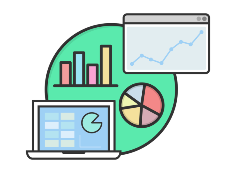
Data analytics are an essential component of any business application nowadays. This enables organizations to make vital decisions. It is critical to outline extensive volumes of data, both understandably and interactively.
Charts are attractive, simple to grasp and extremely valuable for interactive data representation and visualization. There are several open-source and premium graph libraries in JavaScript (with an angular wrapper) for stunning data visualization.
In this post, we’ll look at the top angular chart library for attractive and interactive data visualization.
First, we’ll look at the open-source Angular graphics library, followed by premium Angular graphics libraries.
Continue reading!
Best Open Source Angular Graphics Libraries
1. Ngx-charts
It has amazing math functions, scales, axis and shape generators, and more. It renders and animates SVG elements with all the binding and performance awesomeness of Angular. use d3 for.
There are a plethora of opportunities when outsourcing all processing to Angular, AoT, Universal, and other components made available by the Angular platform.
We can use CSS to alter the styles using Ngx-Charts. The ngx-charts components can also be used to construct custom charts. Its developer community is flourishing.
Installation
You may install ngx-charts charts using NPM, as shown below.
- npm install @swimlane/ngx-charts –save
Chart Types
- Horizontal & Vertical Bar Charts (Standard, Grouped, Stacked, Normalized)
- Line
- Area (Standard, Stacked, Normalized)
- Pie (Explodable, Grid, Custom legends)
- Bubble
- Doughnut
- Gauge (Linear & Radial)
- Heatmap
- Treemap
- Number Cards
- Customization (Özelleştirme)
- Autoscaling
- Timeline Filtering
- Line Interpolation
- Configurable Axis Labels
- Legends (Labels & Gradient)
- Advanced Label Positioning
- Real-time data support
- Advanced Tooltips
- Data point Event Handlers
- Theming
- Works with ngUpgrade
2. Ngx-echarts
eCharts is an open-source, web-based, cross-platform tool for rapidly rendering interactive visualizations. With 39.6k ratings and 13.2k forks on Github, ECharts is regarded as the world’s leading visualization development tool, ranking third in the GitHub visualization tab.
It can run well on both PCs and mobile devices. Internet Explorer 8/9/10/11, Chrome, Firefox, Safari, and so on. Compatible with most recent web browsers, eCharts uses ZRender, a graphics rendering engine, to generate intuitive, interactive and highly adjustable images.
Installation
You can install ngx-ecarts using NPM or yarn, as shown below.
- # if you use npm
- npm install echarts -S
- npm install ngx-echarts -S
- # or if you use yarn
- yarn add echarts
- yarn add ngx-echarts
Chart Types
- Line series
- bar series
- scatter series
- pie charts
- candle-stick series
- boxplot series for statistics
- map series
- heatmap series
- line series for directional information
- graph series for relationships
- treemap series
- sunburst series
- parallel series for multi-dimensional data
- funnel series
- gauge series
- Customization (Özelleştirme)
- Loading Handling
- Event Handling
- Real-time data update
- Initial Options
- Auto Resize
- Theming
- Connect Charts
- Draggable Charts
- 3D Charts
3. Ng2-Charts
Chart.js is a popular open-source JavaScript chart toolkit. Chart.js employs HTML5 canvas, which delivers excellent rendering performance in all recent browsers (IE11+). Angular provides schematics for easy integration into the application.
Installation
You may install ng2 charts using NPM as shown below.
- # if you use npm
- npm install –save ng2-charts
- npm install –save chart.js
Chart Types
- line chart
- bar chart
- radar chart
- pie chart
- polar area chart
- donut chart
- bubble chart
- scatter chart
- Customization (Özelleştirme)
- Legends
- Labels
- Colors
- Tooltip
- Theming
- Combine Charts
- Options (as from chart.js documentation)
4. Angular Plotly.js
Angular-plotly.js is a plotly.js angular component developed by plotly. It supports Angular 9.x; if you wish to use it with Angular 8.x, use the angular-plotly.js@1.x version.
Plotly.js is a high-level, declarative graphics framework built with d3.js and stack.gl. Plotly.js has over 40 chart types, such as scientific charts, 3D charts, statistical charts, SVG maps, financial charts, and more. It has 11.2k stars and 1.3k forks on GitHub.
Installation
You can install plotly.js using NPM or yarn, as shown below.
- # if you use npm and yarn
- npm install plotly.js-dist
- yarn install plotly.js-dist
Chart Types
Basic Charts:
- Scatter Plots
- Bar Charts
- Line Charts
- Pie Charts
- Bubble Charts
- Dot Plots
- Filled Area Plot
- Horizontal bar charts
- Sunburst Charts
- Sankey Diagram
- Point Cloud
- Multi Chart Types
Statistical Charts:
- Error Bars
- Box Plots
- Histograms
- 2D density plots
- parallel categories diagram
Financial Charts:
- Waterfall Charts
- Indicators
- CandleStick charts
- Funnel and Funnel Area Charts
Maps:
- Mapbox map layers
- Mapbox density heatmap
- Choropleth mapbox
- lines on maps etc.
3D Charts:
- 3D Scatter Plots
- Ribbon Plots
- 3D Surface plots
- 3D mesh plots etc
- Customization (Özelleştirme)
- Download as SVG / PNG
- Data export
- Events Handling
- Auto Resize
- Scroll
- Zoom
- Filter
- Animation
- Group by
5. PrimeNG Charts
PrimeNg chart components are built on Charts.js 2.7.x, an open-source HTML5 chart framework. It is an Angular-specific set of rich user interface components. All widgets are open source and free to use under the MIT license.
Installation
You may install PrimeNG Charts using NPM, as shown below.
- # if you use npm
- npm install primeng –save
- npm install primeicons –save
- npm install chart.js –save
Chart Types
- pie chart
- doughnut chart
- line(line or horizontal bar) chart
- bar chart
- radar chart
- polar area chart
- Customization (Özelleştirme)
- Responsive
- Event Handling
- Labels
- Legends
- Tooltip
- Width and Height
6. Ngx-Charts
Data visualization is critical in web application development because it allows users to make sense of complex data sets. This is when ngx-charts come in handy.
Ngx-charts is a popular charting package for Angular projects, offering a variety of customizable and interactive charts. With ngx-charts, you can simply add amazing charts to your Angular applications, whether you’re creating a dashboard, a reporting tool, or another type of data visualization solution.
This session will go over how to get started with ngx-charts, the many chart types it provides, and how to alter them to meet your project’s requirements.
Supported chart types
Ngx-Charts is an Angular charting toolkit that supports a wide range of customizable and interactive chart formats. ngx-charts supports several chart types, including line, area, bar, horizontal bar, pie, doughnut, gauge, heat map, force-directed graph, bubble chart, and others.
Line and area charts are useful for displaying trends over time and comparing numbers across two or more categories.
The bar and horizontal bar charts are useful for comparing values across categories and displaying data in a ranking fashion.
Pie and doughnut charts are effective for displaying data as portions of a larger picture and can aid in quickly visualizing data in a basic and straightforward manner. The gauge chart is ideal for demonstrating progress toward a specific goal or target.
The heat map graphic depicts data distribution and patterns in two dimensions, whereas the force-directed graph is suitable for showing complicated relationships and network architecture. The bubble chart is appropriate for displaying relationships among three or more data dimensions.
Overall, the suitable chart type in ngx-charts is determined by the type of data available and the insights you wish to convey. With a solid understanding of the various chart types and their respective capabilities, ngx-charts can assist you in creating effective and visually appealing data visualizations for your Angular project.
Usage
I’ll show you some basic examples of the charts that I frequently utilize. Many chart options are configurable, but we will only discuss a handful.
You can get a description of the adjustable attributes for each chart here. These charts are commonly used in a variety of fields, including business, finance, and science, and can assist you in efficiently communicating complex facts and insights.
I’ll provide a summary of a few of the various properties:
view Specifies the chart’s size (width and height). If left undefined, the chart will adjust to the parent container size. – The chart’s data scheme – the chart’s color scheme (custom schemes are also available).
- xAxis – show or hide the x axis
- yAxis – show or hide the y axis
- showGridLines – Show or hide the grid lines (xAxis or yAxis must be shown for this to operate).
- Formatters: format the text. Examples can be found in the following code snippets.
- dataLabelFormatting
- tooltipText
- yAxisTickFormatting
- xAxisTickFormatting
- valueFormatting
Conclusion
In this article, we’ve looked at five of the best open-source angular chart libraries, as well as some premium options. I hope you liked this essay. Please offer your useful thoughts and suggestions in the comment area below.